Last week, while strolling through the wilds of Silicon Valley on my way to "work" (I love my job too much to think of it as work; I refer to it instead as "flow central", but that’s fodder for another post), I passed by a Muzak cargo truck. Yes, that Muzak, of tunes and elevators.
The broad tall cargo wall of the truck was emblazoned with the Muzak logo:

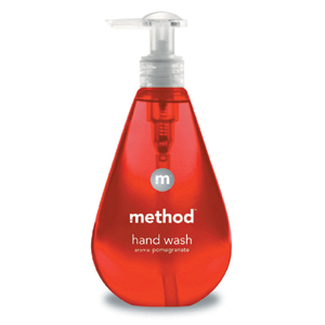
And I couldn’t help but think that the Muzak "m" felt a lot like the "m" logo found on the side of a bottle of Method soap:

Yes, to a graphic designer they’re quite different, but to everyone else they’re pretty close. They are, for all intents and purposes, doppelgangers. I find this notion of brand doppelgangers quite intriguing. Is this good? Bad? Irrelevant? I’m not sure yet, but I’d like to think more about it.
Can you think of other examples of brand doppelgangers? Drop me a line or leave a comment.
Mahalo.


