Last week, while strolling through the wilds of Silicon Valley on my way to "work" (I love my job too much to think of it as work; I refer to it instead as "flow central", but that’s fodder for another post), I passed by a Muzak cargo truck. Yes, that Muzak, of tunes and elevators.
The broad tall cargo wall of the truck was emblazoned with the Muzak logo:
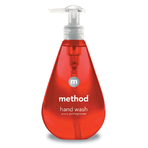
And I couldn’t help but think that the Muzak "m" felt a lot like the "m" logo found on the side of a bottle of Method soap:
Yes, to a graphic designer they’re quite different, but to everyone else they’re pretty close. They are, for all intents and purposes, doppelgangers. I find this notion of brand doppelgangers quite intriguing. Is this good? Bad? Irrelevant? I’m not sure yet, but I’d like to think more about it.
Can you think of other examples of brand doppelgangers? Drop me a line or leave a comment.
Mahalo.


How about the ultimate “M” brand doppleganger? M&M candies!
Don’t they all look pretty similar? Are the other ones leveraging the good feelings of candy coated chocolate (or am I reading too much into it)?
take a look @ the creative commons icon to the (bottom) left — a bold gothic face in a circle… the creation of new, never-before-seen icons for brand is becoming nearly impossible. how many ways can you depict “overnight delivery” or “wireless technology” in 100 pixel square? this is perhaps a reason for the pervasive use of initialism in identity marks (or we’re simply becoming a lazy lot)… then, some fun art-math: 26 characters (X) the number of typefaces actually worthy of use in a mark… well, it’s a pretty low number — so, the odds of doppelganger marks are pretty high. so, conversely, when i see something truly delightful, i pee a little… like every time i see a macmillan electric truck pass by: http://www.mcmillanco.com/ … now, that’s a good “m”…
quite true, hunter.
read something about the logoworks.com -discussion (your logo for a fiver!).
seems that also (soft) plagiarism is nothing that can really be stopped now that the design toolbox stands wide open.
calls for different ways to differentiate – but that’s good – and we all know that for a long time
This one turned up recently – a clear case of… well, you decide.
Quark, the company behind the desktop layout software, recently rebranded itself (probably to add buoyancy to their sinking ship) and their mark happens to look exactly, but for colour, like the Scottish Arts Council’s logo mark.
http://www.quark.com/
http://www.scottisharts.org.uk/
I think it’s happening not just with graphics, but with business models too. Hollister is the new Abercrombie. Take a stroll through a Hollister clothing store, if you can stomach it, and consider their attempt to create a brand and sell you an identity. In one stop, you can buy the same clothes, same music, same dvds, same Surfrider Foundation membership, same pooka shells and wrist cuffs (once edgy but now mainstream), the same material lifestyle pretty much and be just like the people on the covers of the magazines they also sell there. Hollister is capitalizing on the image of existing beach communities that have developed a culture of their own, and bringing them mainstream by way of clothing emblazoned with things like “hermosa beach” “zuma beach” “san clemente” “dana point” and a slew of other “cool”, but actually real So-Cal towns, that mean nothing to you, unless, you actually live in California and know where those places are. But then, is it cool to wear fictional “Dana Point Surf Club” shirts if you live in Santa Cruz?
What I didn’t mention before that tangential rant was that the stores’ (Hollister and Abercrombie)layouts, lighting, decor, music, products–the vibe in the store–are extremely similar.
Hollister is a spinoff of Abercrombie,right?
hollister is to A+F what old navy is to gap… same parent company. retail is littered with these combo punches: limited brands, williams-sonoma inc., gap inc., etc…
I just found your site and think it is great. I don’t think the “M” is a rip but can see how one would remind you of another. If you want to see a few crazy rip offs – look here:
http://www.baddesignkills.com/logoworks/
hollister and abercrombie are both great its not like hollister is copying off of abercrombie first hco is so west coast and a&f is so east coast tats wat could be the big difference