Designing sticky messages

As I've learned over the past few years of teaching the Creating Infectious Action course at the Stanford d.school, it is possible to consciously design something to be viral.  If you have a remarkable offering and a system to spread the word, all you need to be viral is a sticky, memorable message.  Easier said than done, but at least there's a list of reliable design guidelines.  That's progress.

Last week Tom Perriello won the battle for the congressional seat of the 5th District in Virginia.  An underdog in the race, Perriello won the election in no small part because of effective messages, such as this remarkable commercial:

This is nothing if not a memorable, sticky message, artfully designed. It is so because Perriello hews closely to the "SUCCESs" algorhthym laid out by Chip and Dan Heath in their wonderful book Made to Stick. Deconstructing this ad shows us these component parts:

  • Simplicity: this commercial is of NASCAR country, designed for NASCAR country.  As such, no explanation of the sponsorship stickers on this race car is necessary.  This is about taking money from people with a lot of money.
  • Unexpectedness: when was the last time you saw a race car in a political ad?  When was the last time you saw a candidate ripping stickers off said race car?  Not quite riveting, but certainly memorable.
  • Concreteness: each of those stickers contains the logo of a real company.  Instead of referring to a vague notion of "big oil" as many other politicians do, Perriello is able to be concrete without wasting his own breath mentioning names, which might be distracting from his bigger message, which is "Vote for Perriello".  He manages to be concrete without being boring.  Using the device of removable stickers also allows him to employ a quite visceral gesture which, when added together, implies a message of change agency: I'm going to remove all of these players from power to defend you, the little guy.  Look how I can tear them off and create a blank slate for the rest of us to build from.
  • Credibility: Perriello wisely leads off with a statement about his opponent's campaign finances in order to establish his own fiscal and moral credibility.
  • Emotions: NASCAR, NASCAR, NASCAR.  More American than motherhood and apple pie, there's nothing with more emotional appeal for his audience than a NASCAR racer.  Notice too the patriotic color scheme.  The car is red and white, while Perriello sports a blue shirt and a red tie.  When all the stickers are stripped away, you get a clean burst of American color.  It's not in your face, but it is there. 
  • Stories:  this ad is just a series of stories.  I count three:  1)  his opponent taking money for his campaign from big oil and power lobbies, 2) we're paying too much at the gas pump, 3) he is taking no money from corporate sponsors so that he can fight for the common man.

While I don't know if the Perriello campaign used the SUCCESs guidelines in designing this commercial, as a finished piece it is a great benchmark of what a truly sticky message should be. 

Design thinking in the New York Times

The New York times ran a great article yesterday called "Design is more than packaging".  Of course, if you’re part of the metacool community, you already know that.  But it is great to see this meme getting out there and sticking.  I’m very happy to see that the article was published in the Business section.  Cool!

Among others, the article mentions IDEO, my employer, and the Stanford d.school, my other employer.

A couple of quotes.

Tim Brown:

Design thinking is inherently about creating new choices, about
divergence.  Most business
processes are about making choices from a set of existing alternatives.
Clearly, if all your competition is doing the same, then
differentiation is tough. In order to innovate, we have to have new
alternatives and new solutions to problems, and that is what design can
do.

George Kembel:

It would be overreaching to say that design thinking solves
everything. That’s putting it too high on a pedestal.  Business thinking plus design thinking ends up being far more
powerful.

Well put, gentlemen!

“Thank you”, not “Hey you!”

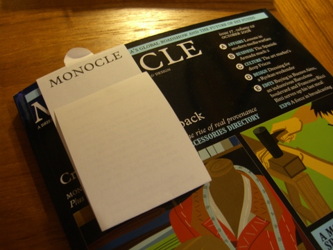
A pleasant surprise showed up a few days ago in my mailbox: the October edition of one of my favorite magazines, Monocle.  I wasn’t expecting to see this issue because I mistakenly allowed my subscription to lapse. 

A second surprise awaited me when I opened up the shipping wrapper (Monocle ships in a protective packet):

Cimg3273

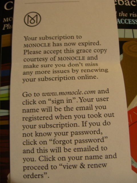
As you can see, a paper flap was tucked in to the cover.  Here’s what this paper flap said when opened:

Cimg3274

When it comes to caring about all the little things that add up to a superior experience, this little flap is extremely telling of the care that has been poured in to the Monocle brand.

First, its language and form are consistent with the brand voice used across rest of the publication.  Who wrote it?  Likely a member of the editorial staff.  The tone and the layout read just like anything else branded "Monocle".  Most magazines forget their voice when it comes to this, the most personal of communications they ever have with a subscriber.  In this situation, why would you speak to anyone in anything other than the editor’s very best voice?

Second, the content is not sales content.  It is relationship content.  They’re speaking to me as an adult.  No weird offers, no tricky language.  No shouting.  No desperation.  Unlike many magazines, which start bugging you to renew months before the end of the subscription with exaggerated offers and wacky incentives, this statement is gracious, factual, pleasant, business-like, and polite.  Just the same as everything else at Monocle — which is the point of having a brand in the first place.

Everything matters.


Push and Pull marketing

Reilly Brennan has a great post over at his blog about the need for better "push" marketing tools: Nobody has figured out push media on the internet yet

Here’s an excerpt:

… push’s shortcomings in the internet era have driven us to
a lot of pull. People have just become omnivorous pullers—a day spent
checking bookmarks across dozens of websites. Of course, that’s not all
bad. Pull can be fun—we want to hunt when we want it. Plus, I don’t
really want a potato salad subscription—I just wanted one recipe.

When he’s not thinking critically about the future of marketing, the multi-talented Mr. Brennan gets to test drive sweet rides like the new Corvette ZR1.  Which definitely qualifies as a "push" car. 

Marketing, sneezers, Breezers, and the Big Sort

Pic0121

I snapped this photo of three Breezer bikes outside a Palo Alto cafe.  Three women rode up separately and then sat together for a chat and some coffee.  This photo says everything about the state of marketing and product design today.  That is, marketing = design = marketing.  You can design a bike to market itself, and you can design your marketing to make your product design more meaningful.

I’ve written before about the great bikes designed and marketed by Breezer.  They are what they are: a turnkey commuter bike, all sorted out for you, ready to ride and fun to ride, with just enough aesthetic flourishes to make you look back at the bike once or twice once your reach your destination.  In a world captivated by spandex-carbon-fiber-titanium-tour-de-france bikes, the Breezer bring a little bit of the Dutch bicycle aesthetic to the US, leavened with some wild California hippie mountain bike DNA.  It’s the kind of product that makes for happy owners, and happy owners like to tell other people about their happy experiences (as I’m doing now).  In the parlance of Godin, they sneeze, and other people catch the virus.  In this case, it’s a Breezer virus, transmitted from friend to friend.

The good news is, it’s easier than ever to take a remarkable offering and then get the sneezers sneezing.  Why?  Because of a pattern of behavior in the US which the author Bill Bishop calls the "Big Sort".  Here’s an excerpt from an Economist article by the same name:

Because Americans are so mobile, even a mild preference for living
with like-minded neighbours leads over time to severe segregation. An
accountant in Texas, for example, can live anywhere she wants, so the
liberal ones move to the funky bits of Austin while the more
conservative ones prefer the exurbs of Dallas. Conservative
Californians can find refuge in Orange County or the Central Valley.

Over time, this means Americans are ever less exposed to contrary
views. In a book called “Hearing the Other Side”, Diana Mutz of the
University of Pennsylvania crunched survey data from 12 countries and
found that Americans were the least likely of all to talk about
politics with those who disagreed with them.

Intriguingly, the more educated Americans become, the more insular
they are. (Hence Mr Miller’s confusion.) Better-educated people tend to
be richer, so they have more choice about where they live. And they are
more mobile. One study that covered most of the 1980s and 1990s found
that 45% of young Americans with a college degree moved state within
five years of graduating, whereas only 19% of those with only a
high-school education did.

Severe segregation is a societal ill, but is in some ways a boon to marketers.  Make a bike that appeals to wealthy, liberal, educated, gregarious, retired boomers?  Super!  Now you can target them by zip code.  Once you get one maven in there with your offering, you can find creative ways to help that maven spread the word… and as they sneeze, the virus will spread fast and wide and deep. 

Again, the three key steps behind designing for (marketing for) infectious action are:

  1. Begin with Desire: create something remarkable.  Do it to the hilt.
  2. Weave sticky stories: design memes that are unavoidably memorable.
  3. Design a System to Spread: select market segments that are heavily networked, and then design a system to spread your meme there

Co-creation means never having to say you’re sorry

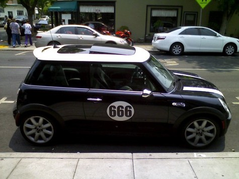
Metacool_666_mini_marketing

The Mini brand is all about fun and owner-specified (if not always owner-created) customization.  Take a look around Flickr and you’ll see an amazing display of creativity.  Mini fans are taking the brand ball and running with it.

As a marketer, the tradeoff is one of control.  Traditional marketing communications, PR, and branding was all about control:  say this, don’t say that, stay on the straight and narrow, conform to this set of brand guidelines or else.  Or else you’ll lose your chance at a promotion to group brand manager of whateverthislatestthingisthatwe’retryingtoflog.  We can see this mindset at work in the current US presidential campaign, where the natural charisma of candidates is strangled by their handlers.  But the "new" marketing, as it were, is all about being open and releasing control.  It’s built around trust, and works from an optimistic point of view which assumes that most everything done with the brand out in the marketplace will be good for the brand.  Brands that work in this new world are those which strive to authentic and speak from a position of truth rather than myth; when you are about truth, then even deviance is not really "off brand", it just adds an additional element of complexity.  And complexity makes things more interesting.

Such is the case with with this Mini I spied on the street.  If you’re Mini, how might you respond to this case of owner customization?  Aside from the content, which may be too edgy for some folks, the customization has been executed very well.  The white of the roundrel matches the white of the hood stripes and roof.  The font used for the numbers is clean and modern.  Even the license plate was carefully considered: it read "VI VI VI".  If I were Mini, I certainly wouldn’t try to shut down this deviance, or even venture to educate it.  No, I’d send this owner a coupon for 20% off their next Mini.  This car is brand-enhancing.  If anything, it raises the bar for clever customization among Mini loyalists, and as such is a wonderful example of creating infectious action

My new car is a…

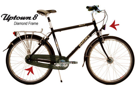
… bike.  In fact it’s this tasty number made by Breezer:

Uptownd_2

I’ve had the bike for about three months now, and have grown to love it on several levels:

  • It’s an integrated experience:  I could have spent a bit less money by cobbling together an equivalent bike from bits and pieces, but the Breezer works really well as a unified whole.  Its designer, Joe Breeze, has a strong point of view on what makes a good bike, and I can feel that as I ride it.
  • It’s fun:  I spent a significant percentage of my childhood free time messing around with bikes.  I lived for my BMX bike.  I was either jumping it off of tall things, riding it through deep pits of mud, fixing it and cleaning it due to the previous two activites, or finding a way to get moneoy tobuy upgrade parts.  Over the course of about six years I took it from being a $80 Huffy to being a mean, lean, nickle-plated jumping machine.  A Mongoose that flew through the air and even landed safely more often than not. By the time I was done modifying it, the only original parts left were the wheels (the original ones ran strong and true), and the chain.  I’m looking forward to hacking on this bike (because as Facebook has taught us, it’s all about user-hackable platforms), and I just love the feel of the wind through what is left of my hair.  Fun fun fun.
  • It looks killer:  Amsterdam is the New LA.  Or Paris.  In other words, the cool look these days is fenders plus bells plus black paint.  Forget spandex and your aero tuck on that carbon fiber frame; sitting upright and maximizing your coefficient of drag is the way to go.  Admittedly, I’ve been unduly influenced by the editors of Monocle on this dimension, but I see the general rise in popularity of the Dutch bike aesthetic as a search for consumptive sobriety for sombre times; the Prius is statement about remorse for over exuberant car-ness, and I think black bikes with fenders are like wearing Timberland boots in a world of Blahniks — the durable, practical,sensible choice.  That happens to also look killer in its own way.

Is the commuter bike the new Prius?

Yes.

What’s old is new again

1

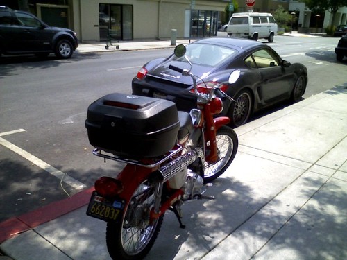
I spied this vintage Honda Cub on the street today in Palo Alto.  And yes, that is a tasty Cayman S just behind it, looking quite gnarly crouched down on a lowered suspension and some expensive three-piece wheels.  But I digress.  Let’s focus on the Cub for now.

As our societal context changes, value propositions that were of no value can suddenly gain back their value, and vice versa.  In a world of cheap gas, a Honda Cub is an inferior mode of transportation in many ways to a Flabigator XL SUV.  But expensive gas is enough to bring one out of mothballs and use it to carry quite a bit of stuff, as witnessed by the large trunk strapped to the back of this one.

Innovation is about finding ways to grow that are right for you.  Do the ideas need to be new to the world?  Not likely, especially since there are few new things under the sun.  It may be as simple as looking back to times past in search of analogous situations.  People are still people.  What worked then that could work now?

Brands are what we say they are: Brand Tags

Brand Tags is a website about something very near the absolute truth when it comes to the essence of brands.  It is truthful because it is not about positioning statements or a theories of meaning emanating from self-proclaimed branding gurus sitting deep inside corporate campuses.  Instead, it uses crowdsourcing to let all of us know what all of us really think brands stand for.

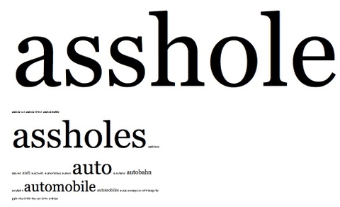
It is instructive and illuminating to peruse the catalog of brands.  For instance, this site helped me understand the gap I feel between my fondness for cars made by BMW and some aspects of the brand that surrounds them.  Here’s what the crowd thinks of BMW:

Metacool_no_bmw_rule

I admire this site because it flips the fundamental equation of formal market research on its head.  Instead of a few asking the many to provide isolated points of data which are aggregated in private for the exclusive use of the few, this is about the many publicly commenting on the work of a few.  It’s brand equity made transparent.  The internet changes the equation of one-to-many communications such as market research so radically that we have to question many of the market research methodologies that worked well for the past fifty years.

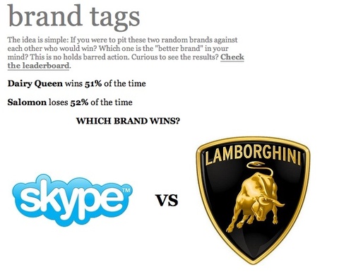
Enough sermonizing.  The battle mode is a fun time sink — watch out!

Metacool_brand_tags