More about simple menus…

I’ve received a few emails challenging my assertion that the In-N-Out menu is simple.  Yes, I agree that the top bank of pre-designed meals on the In-N-Out drive thru menu makes the it a less than perfect example of simplicity at work.  On the other hand, I find conversations about absolutes to be philosophical minefields… I’d rather make a relative comparison and proceed with thinking about how to do more things that are more good and less bad. 

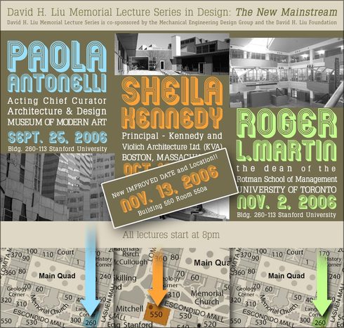
When it comes to menus, more bad (and less simplicity) would certainly look something like this:

113242624_ea0b0004c7_o

photo credit: foomtsuruhashi

A simple menu says so much

Cimg3904

A great benefit of reading a book on simplicity is the secret thrill one receives by finding examples of simplicity at work in the course of daily living.  Including the drive-thru at In-N-Out Burger.

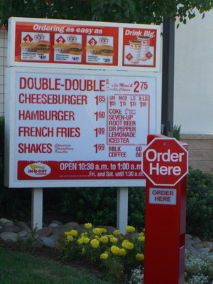
Here’s a simple drive-thru menu snapped from the window of my car.  Lots of Maeda’s Laws at work here.   What makes it simple?  Some random thoughts:

  • An elemental bill of materials.  Want fried stuff?  French fries.  No onion rings.  No curly, corkscrew, or chipped potatoes.  No fried zucchini or wheatgrass.  Simple.
  • Popular nouns, rather than branded nouns.  A cheeseburger is a cheeseburger is a cheeseburger, not a Whopper or a Bacon Western Cheese.
  • Easy to read.  For the most part, a big, painted font.
  • Simple through time.  A consequence (or a driver?) of the previous item.  Since the stuff is painted on, it’s likely to be the same selection at the same price the next time I go.  Knowing that I can expect the thing I like to be there at the price I expect makes it a simpler transaction experience.  This is Law 4 at work.

Reading about Simplicity

I hadn’t read a book in a single sitting since a long night in March, 1995, when I read Ondaatje’s The English Patient after taking The Chunnel from Paris to London.  Just as a movie is more satisfying when consumed as a flow experience, a good book begs to be consumed in whole.  Last week I had the rare pleasure of spending an evening having just this type of superlative book experience in the form of John Maeda’s The Laws of Simplicity.  I devoured it.  I’m already using its lessons in my daily work.  And I look forward to reading it again soon — I think it’s the most important book I’ve read since Don Norman’s Emotional Design.

In this tidy book of just 100 pages, John Maeda walks us through 10 Laws of Simplicity.  This being 2006, I don’t need to list them because you’re better off reading them on his Laws of Simplicty blog (be sure to click on the laws listed down the right column of the page).  I’m particularly enamored of Law 10: The One, which is stated as such:

Simplicity is about subtracting the obvious, and adding the meaningful

Adding the meaningful.  Think about that.  When we strip out the obvious, we edge closer to root nuggets where real value resides.  Meaning is what we seek, what leads to happiness.  The obvious is banal because it is obvious; there’s no challenge or satisfaction in its consumption.  And I believe this state of simplicity is what gives us "universal" offerings and brands such as the iPod, the Citroen 2CV, the Golden Gate Bridge, Muji — each embody Roger Ebert’s sage observation that "The more specific a film is, the more universal, because the more it understands individual characters, the more it applies to everyone."  Unique designs appeal to so many of us exactly because they don’t try to appeal to all of us.  We want the elegant simplicity of rich meaning.

Learning from Burt Munro, Part I

Indian_rocker_cover1

Mr. Jalopy of Hooptyrides showed me this beautiful design detail he shot of Burt Munro’s famous Indian motorcycle record breaker.  The same motorcycle featured in Roger Donaldson’s wonderful movie The World’s Fastest Indian.  I quite liked that flick, especially the opening sequence, which is a  perfect balance of deep technical unabashed gearhead gnarlyness and man-on-the-street, just-tell-me-a-simple-story plot exposition.

Just look at it.  Those two "seahorse" details in the metal plate are there to provide mechanical clearance for the furiously revolving rocker arms on the little terror of a motor found beneath.  You can just see the intake trumpet in the background, poking its snout out like a shy little elephant.  Burt Munro was an incredible innovator.  This is stunning design work.  I can’t help but agree with Mr. Jalopy when he says that "…I am not even particularly interested in motorcycles, but I spent half
an hour looking at this amazing machine and kept finding trick shit
like this. I don’t know that I have seen a greater accomplisment by a
single person."

The more I look at it, the more I feel there’s a wealth of insight to be found in this photo about the process, philosophy, and value of design thinking.  I’m going to keep writing about Burt Munro’s rocker divots for a while, just to see what’s there.  I’d like to hear what you see, too.

Unabashed Gearhead Gnarlyness

4car6

The Citroen 2CV Sahara

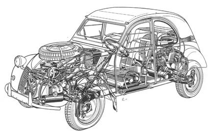
Need four-wheel-drive off-road capabilities?  Stick a second engine and transmission in the rear.  Panoramic sunroof?  A roll-back canvas roof will do. 

Audacious.  French.  A way of thinking beyond the obvious that’s gone missing from Citroen in the decades that passed since a gnarly old Sahara last roamed the rocky roads of southern Spain, but whose iconoclastic sensibilitly can still be found in the work of the crazies at Honda.

A Pitiful Design Observation

1364356689

Have you been watching the World Cup?

During today’s Italy-Germany match I have to admit I was a bit distracted by a recurring thought popping in to my head:  Why did the Italians seem to be sweating so much more than the Germans? 

Of course, after a while, I realized that the ubiquitous underarm sweat blotches I was seeing where actually part of the graphic design of the Italian jersey.  Now, I’m a proponent of thinking through what a design will look like in use, and after it is used, but I find the point of view which led to this design somewhat odd.  Purposeful proactive pit stainage as a premediated graphic design element?  Weird.  Not beausage.

Jeffersonian Simplicity

For me, the highlight of the 2006 Brainstorm Conference was the opportunity to hear Associate Justice Sandra Day O’Connor speak about the intricacies of the Constitution of the United States

In response to an audience question about the staying power of the Constitution (it’s the oldest in existence), she paused, picked up her purse, and took out a copy of the Constitution in pamphlet form — maybe 5 x 2.5 inches.  Just imagine: the document which shaped this country, and continues to guide it and many others around the world hundreds of years later, fits on just a few small sheets of paper.  Marvellously extensible and modular, it is also written in plain language.  Isn’t that something?  For all its enormous generative power, the Constitution is likely more concise and more intelligible than many software license use agreements.

Thank you, Justice O’Connor, for giving us a dramatic lesson in the power of simplicity.  Simple design, but not ever simplistic.

Of course, perhaps that simplicity shouldn’t be surprising.  Why?  Well, because said constitution was penned by a design thinker.