In Memory of Matt Kahn

2-kahn2

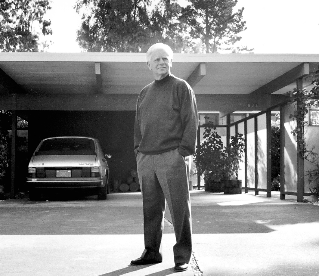
Professor Matt Kahn passed away a few weeks ago.  He was my teacher, and had a big impact on my life.

I met him during the 1990-1991 school year, which was a pivotal one for me. It’s the year where I found my North Star and got serious about pursuing my formal training as a designer.  I was fortunate to spend that summer studying at Stanford’s program at Oxford.  Most of my evenings were spent in jazz clubs in London, and on weekends I discovered the twin joys of live Formula 1 television broadcasts hosted by Murray Walker and the joy of living in a place where so much of the built environment had been designed and engineered with a high degree of consideration.  What an amazing chance to live a few months of my life as a flaneur.  Both were good food for thought.

Up to this point in college I had been unable to resolve a fundamental tension between my love of the humanities and all the writing and reading and the critical thinking which goes along with that domain, and my abiding love of all things mechanical (especially the loud and fast ones).  In a nutshell, I couldn’t figure out whether I wanted to be more like Stephen Barley or Gordon Murray.  And then one Sunday morning over an informal breakfast, a very wise fellow student suggested that I just do both and get on with it.

And so I did.  I came back to campus that Fall and formally began the mechanical engineering design curriculum, and in the spirit of doing both found a way to also study for a humanities degree via Stanford’s amazing STS program.  During that year I took an array of design classes whose lessons I still use each and every day, delivered by a truly inspiring group of teachers, including David Beach, Brendan Boyle, David Kelley, and Matt Kahn.

Matt Kahn taught his foundational Art 60 class with a classic Beaux-Arts approach, meaning that we walked in each day and placed our completed, unsigned assignments on the board (or on a table) before class, and then sat and listened the give and take of Professor Kahn’s critique as he made his way through all the content around the room.  The title of Art 60 is “Design I: Fundamental Visual Language”, and in it you had to complete a certain number of projects of your choosing from a list given out at the start of the quarter.  Professor Kahn, as David Kelley notes, had a truly singular talent for critique, and so these sessions were often some balance of intellectual enlightenment and personal (but temporary) devastation.

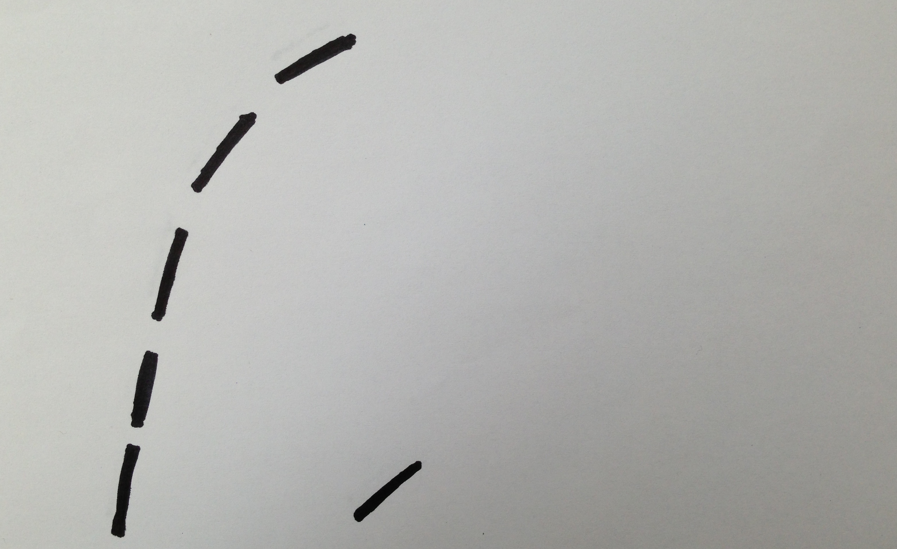
I really struggled for the first month or so of class.  I wasn’t getting it, not at all.  Ever persistent, I kept plugging away. One day I brought in my approach to an assignment which I believe asked you to take a small number of geometric objects and arrange them in a way that conveyed a feeling or emotion.  Using construction paper, I pasted up a composition, brought it to class, hung it on the wall, and then took a seat on one of the stools scattered around the studio.  My intention was to show what being freaked out by something feels like, and it looked like this:

metacool Art 60

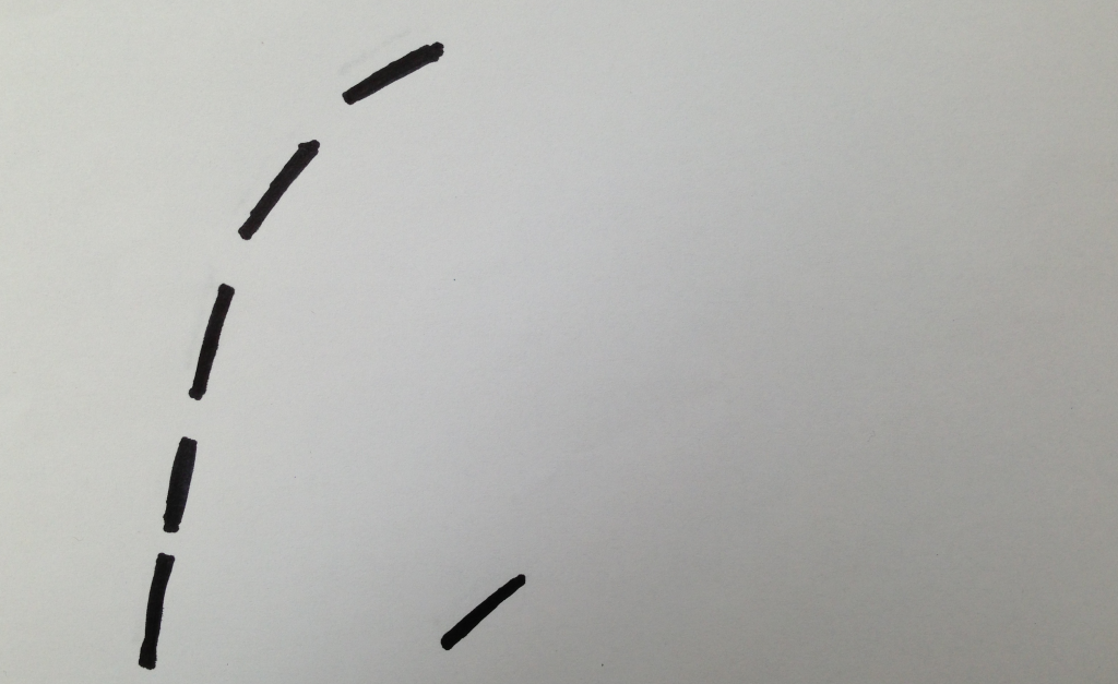
Professor Kahn walked in, and looked around the room, and zeroed in on my piece of work.

Gulp.

“Who did this?” he asked, with an arch of his eyebrows.  I raised my hand up to about chest level and gave a half-hearted wave.

Calmly stepping toward me, he gave me that squint of his, cocked his head a bit to one side,  smiled a wry smile, and then slowly and in a strong voice said,”Who.  Are.  You.  Afraid.  Of?”

Here was his incredible ability to critique the work of others and express it all concisely and with great elegance.  In a millisecond he nailed exactly what I was feeling and thinking when I created that piece of artwork.  Basically, I was scared of being in Art 60.  I was frightened by the prospect of screwing up in front of Matt Kahn.  In that moment, with Professor Kahn staring at me, my internal voice was urging me to respond with the truth: “Answer him with a big ‘YOU!  It’s YOU I’m scared of, Professor Kahn!'”  But before I could stop myself, I blurted out a fuzzy statement along the lines of “Oh no no no no… what I was trying to communicate here was the sense of something being herded or corraled, you know…”

He smiled again.  Paused.  And then quietly said that it was more powerful the way he had described it, and how it worked well when seen from that perspective.  He knew.  And then he squinted again at me, gave me another dose of that inscrutable smile of his, and moved on to discussing the next student project.  I got it—I had done good, but I could do better if I could learn to embrace it all with abandon.

Great teachers have a way of seeing your potential and finding a way to get you there.  They give you challenges and allow you to fail along the way—and let you know it—but never so much that you give up on your dreams.  Matt Kahn was one of the great teachers in my life.  He built confidence in my own creative process as a designer, and for that I will be forever grateful.

Thank you, Professor Kahn.


How the little things can be big for your culture

042b8d4

What makes an organization tick? I learned a lot about IDEO’s culture via the tiny care package pictured above. You can learn big things about a group of people by looking at the little things they create.

I received it while visiting IDEO’s studio in Boston (I work out of our offices in California). I had a packed week of meetings on opposite ends of Boston, and was bouncing from place to place, always on the go. While dashing out the door to catch a train, I was stopped by one of my IDEO colleagues, who handed me this tiny bokja and said “You look like you could use some energy on the road—take care and good luck with everything!” It was a brief encounter, but everything about our culture sits within it. Let me show you why.

In the course of my work for clients at IDEO, we get to experience many different company cultures. In order to be as effective as possible, it’s critical for us to understand what’s important to the organizations we’re collaborating with. To that end, I turn to the three-tiered model of organizational culture developed by MIT professor Edgar Schein. For Schein, the organizational culture happens at three levels:

  1. Artifacts found around the workplace, from your dress code to your furniture
  2. Your Espoused Values—the intangibles your organization publicly declares as important, from strategy to personal behaviors
  3. A set of Basic Assumptions which drive fundamental decision-making at a deep, even unconscious level

Moving from tangible to ethereal, all three can be used to describe any company culture. While values and assumptions can sometimes be fuzzy, artifacts are relatively easy to spot and read, and can reveal a lot of cultural secrets. So I’m always on the lookout for a tasty cultural artifact. It’s kind of fun, in fact.

Back to that care package: some gum, a chocolate truffle, an energy bar, and a packet of very choice Boston Baked Beans. All painstakingly wrapped in cellophane and finished with a handwritten note. What does it say about IDEO?:

  • The Artifact: pragmatic (I ate the energy bar the next day while running to a meeting, then chewed some gum) yet vivacious and a little out there (Boston Baked Beans!). Creatively yet expertly executed, all with a strong point of view and a crisp, empathic design intent: bring a little joy and relief to a colleague who is away from home.
  • Espoused Values: optimism, a sense that a fellow employee is either your friend or could be your friend, a deep desire to help everyone be the best they can be, and a commitment to enjoy the design process as a reward in itself. Plus, a belief in asking for forgiveness rather than permission, and the guts to try out new things to see how they work. Believe me, we don’t have a “Care Package” committee or department—people dream up and create things like this care package because our values encourage them to do what they think is right.
  • Basic Assumptions: we are here to be creative, we deeply value each other, and above all, we ship stuff in order to learn and grow.

That’s IDEO in a nutshell. Or a care package.

When we understand what makes a culture sing, we can focus our energy to preserve its key elements, diminish those which are a drag, and create and improve others through a process of conscious design and innovation.


(a version of this post appeared on my LinkedIn Influencers page)

John McWhorter: Txtng is killing language. JK!!!

This talk by John McWhorter is another of my favorites from TED 2013. It’s elegant, witty, informative, intelligent, entertaining, persuasive. This is so because McWhorter only gives one talk here. Allow me to say more about what I mean by that.

Something which I’ve noticed lately is the communicative power of extremely simple (almost “non-designed”) text slides like those used by McWhorter in this talk. As a speaker, when you employ projected imagery to help communicate the points of your lecture, you increase the risk of distracting your audience from the content delivered by your own voice. What I mean is that if the image you project doesn’t exactly follow the words you speak, or easily relate to them, all of a sudden you’re asking your audience to process two streams of loosely connected information. That’s a difficult task and a big ask, because you’re essentially asking your audience to process and understand two talks in parallel.

1DR -— how does this happen?

I am guilty of this transgression. I find that the probability of inflicting this harm on your audience increases when you choose imagery not of your own creation, be it a stock photo or an image that’s almost to your point, but not quite. Unsolicited advice: if the image you project isn’t the thing you’re talking about, choose a different image. Or forgo the image altogether. Better to take McWhorter’s path and employ very simple slides with very carefully selected letters and words… just a few. And those words should match those coming out of your mouth, so that the visuals reinforce what you’re saying, instead of competing with it.

This doesn’t apply to talks whose entire point is to show visual content, of course. With those, let it all run free in maximum technicolor glory.

Hope this isn’t 2M2H. 10X. 86!

Seinfeld + Porsche: a shared creative process

To paraphrase Jerry Seinfeld, comedy writing and car design are two things you don’t see people doing in public. So here’s a video peek at Seinfeld’s private creative process—and that of Michael Mauer and Mitja Borkert, both design leaders at Porsche. When it comes to revving up your own creative process, they’re inspiring studies.

How do these three creative masters do what they do? Let’s watch and see what we can learn:

Seinfeld, Mauer, and Borkert are all extremely thoughtful about their craft and dedicated to constantly raising the bar for what “good” looks like. These videos are master classes in creativity, with five important takeaways:

Insist on Great Fundamentals. All three know the power of getting the creative rocket pointed in the right direction. For car designs, Borkert declares “…the proportions are the crucial beginning of any project.” The same holds true for jokes, where Seinfeld says “I like the first line to be funny right away.” They don’t spend energy making a lousy shape attractive, or a bad joke funny. It’s about having the right architecture from the start. Seinfeld even talks about his comedy writing in structural terms, saying “…I’m looking for the connective tissue that gives me that really tight, smooth link, like a jigsaw puzzle.” The creative process for both great cars and great jokes starts with great fundamentals.

Obsess Over Details. All three focus on the kinds of details—from minute surface transitions on a windshield to nuances of syllables in a string of words—that none of us civilians ever notice. Except that we do, because when it comes to great things, it’s the overall experience we remember, and that experience is shaped by myriad details whose sum is greater than the parts. Details such as the fun index of a string of words like “chimps in the dirt playing with sticks”. Details such as the depth of an air outlet. At the seven minute mark you can hear Mauer questioning a surface transition on the back bumper of the Panamera. As a layperson, I couldn’t see anything amiss, but you know it was a big deal for them. Details matter.

Pack the Right Tools. For creativity to effect change in the world, it requires expression. Seinfeld’s tools are yellow legal pads and blue Bic pens. The Porsche equipment used by Mauer and Borkert costs quite a bit more, but they have it all at hand, too. Having the right tools nearby deftly eliminates the procrastinator’s excuse of “I could be creative if only I had the right pen.” Pack your tools, get going, and create!

Lather. Rinse. Repeat. Creativity is hard work. Edison’s observations about 1% inspiration and 99% perspiration are true. It can be tempting to take the path of least resistance. But when faced with thorny challenges, gritty optimism is the wellspring for creativity and magic solutions. Interestingly, both Seinfeld and Mauer found it a challenge to resolve their respective tale and tail. For Seinfeld, it required hard work to uncover the breakthrough Pop Tarts line, “…they can’t go stale because they were never fresh”. For Mauer, the right shape for the Porsche station wagon was terra incognita: “…the rear of it is certainly the greatest challenge—we never had that kind of car at Porsche before.” Designers made piles of sketches, stared at clay models, and iterated often to come up with that beautiful 3D Porsche signature effect. Whether it’s a car or a joke, lathering, rinsing, and repeating—over and over—is what transforms good into great.

Master Your Creative Domain (But Then Forget About It). Notice how fluid the creative process feels for Seinfeld and the Porsche designers. A creative process isn’t something you learn in a day and use forever, and it isn’t a set of simple steps you read out of a manual. It takes years to develop, and the more you use it, the more your confidence grows. Drawing, surfing, playing the piano—it’s true for all creative endeavors. At some point you move beyond rote process so that it all becomes your natural way of being, what you were put on earth to do. Then you can create like the masters Seinfeld and Mauer and Borkert, with great confidence, joy, energy, and total engagement in the task at hand. First you master the art, then your own process, then you forget all that and just do it.

There’s a universal creative process we all share—but as many permutations of it exist as there are people on the planet. The point is to be conscious of your own process, and to always be evolving it. Now, I’ll never write a joke like Seinfeld or profile a headlamp like Mauer, but I can learn from the specifics of their creative approach in order to improve my own. In the details of another person’s creative process are the universals we can all learn from.


(a version of this post also appeared on my LinkedIn Influencers page)

Unabashed Gearhead Gnarlyness: General Motors

There’s some amazing design work happening at GM these days. Though I have not driven either model (they’re not on the market yet), I’m really impressed by the design work done on two new GM models, the 2014 Chevrolet Corvette and the 2014 Cadillac CTS.

Here’s a view of the new Corvette Stingray:

6a00d83451c31c69e2017d42ab7495970c-800wi

And here’s a shot of the new Cadillac CTS:

6a00d83451c31c69e2017d42ab74fb970c-800wi

Each car manages to capture the essence of its respective marque while also breaking new ground aeshtetically. These designs feel very confident and bold, and everything from the overall proportions to very small details in the interiors really work and cohere nicely. I can’t wait to see future variants of these two hit the market over the next few years—here’s hoping they’ll ship a CTS-V Wagon!

Great designs like these don’t happen by accident. And it’s not just about having great designers at work, either. For things like this to happen, the entire business system needs to be well, firing on all cylinders. Culture and organizational dynamics are key to making great stuff happen. You can tell a lot about the fitness of a system based on what it produces, and these two cars provide some substantial evidence that GM knows how to generate, develop, and execute good ideas once again. And that’s pretty gnarly in my world.

Why this Sprinter van conversion shows us what good prototyping looks like

Have you ever held a wooden surfboard?  What a revelation.  In my humble opinion they are some of the most beautiful objects around

Paul Jensen is a master craftsman who, among other things, creates truly gorgeous surfboards out of wood.  He also does the occasional van conversion, transforming the inside of a Sprinter van from this:

P1090636%255B5%255D

… to this format, fully fettled for far-flung adventuring:

Clip_image124%255B5%255D

In this photo blog, Paul documents almost every build step and design decision of this conversion.  As a builder, I love to see someone else's creative process tick.  It's pretty amazing to see how Paul takes a bunch of rather humble materials and transforms them into a bespoke interior for this Sprinter, in turn transforming it into an adventuremobile.  I want one!

We can learn a lot about good prototyping process from Paul.  One of my principles for innovating is "anything can be prototyped, and you can prototype with anything".  Speaking of prototyping with anything, Paul used 1/8" thick plywood to create this quick mockup of the interior of the Sprinter van:

Scale%2520Model%25202%255B4%255D

Scale%2520Model%25203%255B4%255D

Each square represents one square foot in the actual van, making this prototype a very effective way for Paul to check his initial plans, improve his design ideas, and communicate them to his client.  The little plywood dude there helps everyone translate the scale model to reality.  It's also a fast and cheap medium to work in, so even if his initial design direction took them down the wrong road, there's not much ego to be lost in chucking the whole thing and starting over.  Much, much easier than going from drawings directly to the van and only then realizing that your client thought that "left" meant behind the driver and now the sink is on the wrong side. 

Now, for those of you busy pivoting your startup's iPhone app to one that actually might make money, putting cabinets in a Sprinter van may seem simultaneously quaint and trivial and even passé, but path dependence is for real.  Getting on the wrong design trajectory bites even the biggest and most expensive of endeavors.  Earlier in my career I was part of a massive online software project, and via a lack of prototyping we overlooked some key user needs and ended up spending years engineering a platform that was ulitmately a dead end.  Careers weren't ruined, but it would have been a lot more fun and profitable to build the right thing in the first place. 

Whatever you're working on right now, I want you to build a prototype of it tomorrow.  No matter what it is, you can figure out how to make a quick prototype.  I know you can.  Give yourself and hour to create the prototype, and then spend an hour showing to people.  Just build it like you mean it, and listen like you're wrong.  It'll be awesome.