Director’s Commentary of the Week: Nintendo Wii

Here’s a stunning collection of Director’s Commentaries from the creators of the Nintendo Wii gaming system.  The commentaries are transcripts of a discussion and are not in video form.  Fortunately, they’re broken into several chapters, so it’s easy to find something you might be interested in hearing.  There’s an enormous amount of material here, so I haven’t been able to digest it all.  But here are some gems:

"This may sound paradoxical, but if we had followed the existing
Roadmaps we would have aimed to make it “faster and flashier.” In other
words, we would have tried to improve the speed at which it displays
stunning graphics. But we could not help but ask ourselves, “How big an
impact would that direction really have on our customers?” During
development, we came to realise the sheer inefficiency of this path
when we compared the hardships and costs of development against any new
experiences that might be had by our customers." – Genyo Takeda

"I’ve said this countless times already, but when developing Wii, I
thought constantly about what we could do to stop games being regarded
with hostility in the family. So I came up with a suggestion, perhaps a
rather outlandish one! (laughs) What I thought was that if a parent
said that their child was only allowed to play games for one hour a
day, how about making it so the console actually turns itself off after
an hour? I realize the head of a games company shouldn’t think things
like that!" – Satoru Iwata

"If only one team is developing something, they’ll only ever pay
attention to the same old issues, sometimes discussing them all day
amongst themselves to find a solution. But this time, thanks to the
System Function team, I was able to go and talk with Kawamoto-san or
have a look at Kuroume-san’s designs. Both physically and mentally, I
found this to be a less stressing, more laid-back way to do things.’ – Tomoake Kuroume

I hope the Wii does well.  It’s rare to see a series of closely-spaced market introductions (XBox, Playstation 3, Wii), where one is so dramatically different in terms of the innovation bias of the originating firm.  Where Sony and Microsoft seem to lead with technology, then business, and then think about the user experience, Nintendo is obviously leading with people and desirability, feeling that the other two factors will follow naturally if there’s market lust for the Wii.  Reading about the care and thought put into the interpersonal communication schemes which the Wii enables reminds me of that other great human-centric business-technology system, the iPod + iTunes + iMac.  Perhaps the catchphrase of 2007 won’t be "How can we be the iPod of our cateogry?", but "How can we be like the Wii?"

Thanks to Anthony Pigliacampo from Freddy & Ma and Gel-Bot for telling me about this treasure trove.

Some Sick Reading

Much to the chagrin of my family, our long-awaited winter vacation was interrupted by a nasty cold or a mild flu which I came down with post Boxing Day.  Oh well, that’s life.  The good news is that, with lots of time suddenly on my hands, I’ve been able to tackle the pile of books that’s been growing on my nightstand, along with a few which came to me as Christmas presents.  If you’ll indulge me, here’s an overview of what I’ve been reading:

Designing Interactions, by Bill Moggridge.  I’ve actually been tackling this one for about a month now.  For the sake of full disclosure, Bill is a colleague of mine at IDEO.  But this is not a book about IDEO, by any means.  I’ve learned so much reading it, and I keep going back and re-reading the interviews and watching the DVD.  I can’t get enough of Bill Verplank’s point of view on interaction, and I’ve read John Maeda’s chapter oh, maybe five times.  The Rob Haitani chapter alone should be required reading for every product manager in the world.  In fact, if I could pass a universal law, I’d make that chapter required reading for every product manager in the world each January 1 of each and every new year.  This book now is the anchor of my innovation library, and I predict in five years it will show much evidence of active use, perhaps even some beausage.

Phaedon Design Classics, 001-999: a comprehensive, full-color survey of iconic designed objects in the tradition of Stephen Bayley’s book In Good Shape.  I wish I had this book earlier in my career — flipping through its pages has fleshed out my sense of design history.  For instance, one of my colleagues has a Dieter Rams-designed bookshelf in his office, and I’ve spent the past two years analyzing its structure in five-minute chunks during meetings there, but I never knew it was a Rams design.  Now it makes much more sense to me.  On the other hand, the three tomes of this collection seem to be full of content errors, at least based on the really basic errors I’ve found whenever the books talk about cars, such as:

  • The pages about the Porsche 356A Speedster (Entry 461) are accompanied by a photo of the original 356 prototype, which is not a Speedster.  Totally different cars from a design standpoint.  One is mid-engine, the other hangs it off the back. To use the photos interchangeably not only wrong, it’s downright against the law.
  • Entry 496, which is about the Fiat 500, is illustrated with a blueprint of the Fiat 600.  It’s not wrong wrong, but it’s like putting a picture of a Lusitano in an essay about Shetland ponies.
  • Entry 817 on the Fiat Panda ( a car I dearly love ) states that "[Giorgetto Giugiaro] began creating cars witih sharp edges and straight lines… the Panda is a testament to this particular style, with its box-like shape and large, square-shaped headlights, finished with five chromed lines diagonally gracing the front of the grille."  The entry is, as you’d expect, illustrated with a photo of a Panda with the five chrome lines on the grille.  Which is all fine and well, except for the fact that the original Giurgiaro design which went into production featured a metal grille with nineteen vertical air slats, with no chrome to be found.  To say otherwise is to obfuscate the history of design.  And, the original design was much cooler than the later chrome restyle.
  • BMW 2002, entry 697.  And I quote:  "The  models built between 1968 and 1973 had larger bumpers specifically for the US market…".  No, actually, quite the opposite is true; the "big bumper" 2002 models came to the US from 1974 through the 1976 model year.  Not quite a criminal assertion, but close.  These details are just details, but they matter in a history book.

To be sure, it’s a fascinating and instructive set of books, but errors such as those above make me wonder if the utility of these types of works in the age of the Web is rapidly approaching zero.  Aside from the fact that a three-volume compendium is likely to be difficult to compile, expensive to produce, buy, and sell, and take up a lot of shelf space, it just screams to be done on the web.  As in a series of hyperlinked web pages.  Perhaps as a wiki, maybe not, but something which could modified as need be when thousands of eyeballs dig up shallow bugs such as big bumpers on a 2002.

The Creation, by E.O. Wilson.  The most important book I read in 2006.  If Al Gore’s An Inconvenient Truth didn’t scare you, The Creation will.  Wilson speaks from a position of great moral and scientific authority.  While I’m confident that we can find a way to dramatically reduce greenhouse gas emissions over the next decade, I’m now more concerned than ever about the rate of species extinction on land and in the oceans.  If you haven’t read Wilson’s book, you owe it to yourself to spend some time with his eloquent words and deep wisdom.  And pass it along to a friend.

Cough cough, sniff sniff.

Aesthetics matter… a great deal

As told in this great NYT article about the "Four Star Soup Kitchen" of chef Michael Ennes, aesthetics matter a great deal.  Certainly more than we give them credit.  The care and attention to detail which goes into a meal, for example, can be a source of great pleasure and meaning for both cook and diner.  Even in the context of a so-called soup kitchen.

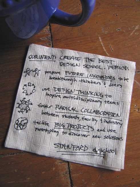
Of course, you needn’t trust me on this.  Virginia Postrel has written a wonderful book on the subject, The Substance of Style, and you simple must check out her 2004 article titled Why Buy What You Don’t Need?  The Marginal Appeal of Aesthetics.  I use stories and arguments from her article in a yearly lecture I give at Stanford on the topic of meaning and the design of meaning.  I love her take on Maslow’s hierarchy, and where she places aesthetics in the stack.  And I think you already know I believe it’s Virginia who is right.

Director’s Commentary: Basecamp Help

Helpbutton_1

The good people of 37signals published a wonderful Director’s Commentary a couple of weeks ago in the form of a post called "Basecamp help".  What’s a Director’s Commentary?  It’s the voice over track on a DVD where the director explains everything that was going on when he shot a scene.  They exist in the world of design thinking, too, as I wrote a while back:

Wouldn’t it be great if, in a similar fashion, we could hear and see
great designers talking about their craft?  When I was a practicing
engineer designing tangible things, there were tens, even hundreds of
details embedded in my designs which I knew about, maybe the rest of my
team knew about, but which were essentially invisible to the world at
large.  Which is fine; it isn’t the job of end users to be thinking
about the kinds of details and decisions that interest a professional
design thinker.  But for students in training, and for other
professionals, what better way to truly appreciate the enormity of the
task of design than to take a walkthrough around a real design with
another real, living designer?

In his post, I admire the way Jason walks us through all the details that go into even a minor rework of a software interface item.  In general, stuff from 37signals works really well, and it’s not due to luck or the alignment of the planets.  They’re talented designers who sweat the small stuff. 

Belly Tanker Beausage

Latch1

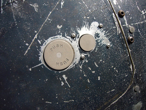
I love this photo detail from Bobby Greene’s "Aircraft latches and you" post from his wonderful blog Automotive Addictions and General Tomfoolery.  It’s a blog about his very gnarly belly tanker speed racer.  It’s an ode to gearhead gnarlyness, authenticity, and just plain doing stuff.  I love it.

I also dig the photo because it’s a great example of beausage, the beauty which comes with use.  All those scratches, dents, and subtle surface deformations couldn’t be designed.  They come from being out in the world, and they’re beautiful in a very organic way.

Congratulations to Bobby for getting the tanker up and running — and running WFO, no less! — again.

Cool.