Here’s some brain fodder to play with the next time you’re stuck in traffic: Evolution of Car Logos
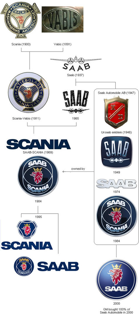
Just look at the evolution of the SAAB badge. Amazing how much churn there is on the automotive branch of the tree for a brand which only emerged after WWII:
Myself, I like the 1949 badge the best. Don’t like the screaming chicken so much. How does one say "Burt Reynolds" in Swedish?
As I look through this site, I have to admit that many of the older badge renditions are at least as compelling as their replacements, and often more so. Having been a brand manager at one point in my peripatetic career, I sense that the rationale for many brand revisions or logo redesigns are rooted more in internal politics and the need to do something tangible for one’s yearly performance review than in market needs. In other words, most customers probably don’t care if your new logo is slightly better than your old one, especially if they just finally got used to the old one, because it has only been the old for the three years that have passed since the last redesign. As with management, sometimes the best marketing may be no marketing at all…
Anyway, it’s fun stuff. Thanks to Tim for pointing me to this link!

